“We needed cups that look honest—and compost honestly.” That’s how Maya, Head of Brand at Blue Finch Coffee, opened our first call. Her words stuck with me. Because a cup is more than a cup when it’s in someone’s hand at 7:45 a.m. In those seconds, the paper, the print, the message—they all have to align. We brought **ShirongMaterials** into the conversation that same week.
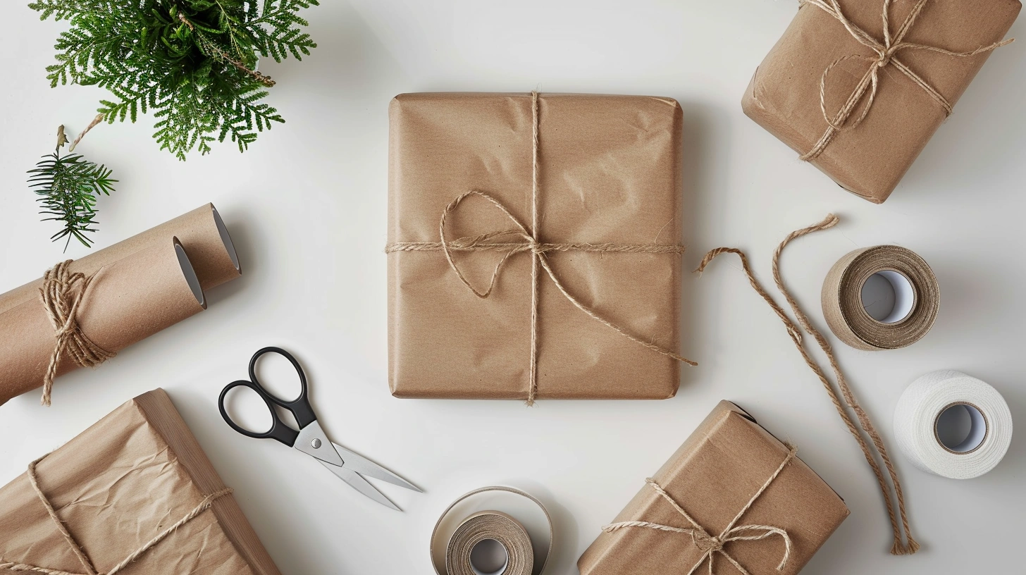
Blue Finch runs across the Pacific Northwest with a loyal crowd and a warm, brown-kraft visual language. The team had been wrestling with color on uncoated stock and mixed messaging around sustainability. People asked at the counter: are these **compostable paper cups**? Do they recycle? The brand wanted clarity without losing their understated aesthetic.
Here’s where it gets interesting: the right material stack can make a cup feel as honest as it looks. But it also asks us to accept trade-offs—ink limits on kraft, fewer embellishments, and messaging that doesn’t overpromise.
Company Overview and History
Blue Finch Coffee started as a single café tucked into a Seattle side street; today it’s a 28‑store chain stretching across the Pacific Northwest. Their visual world is wood grain, natural light, and that quiet kraft palette customers recognize from across the room. The team wanted cups that felt like their cafés: warm, tactile, and easy to trust—no glossy sheen, no plastic vibe.
Sampling plays a role, too. Weekend tastings are a ritual, which meant the program needed branded **2 oz paper cups** alongside the daily sizes. Small as they are, those cups still carry the brand’s voice—and they meet a different set of forming and print constraints because of their tighter curves and smaller print real estate.
The North American market complicates the sustainability story. People routinely ask, “can i recycle paper cups?” The truthful answer depends on local infrastructure. Blue Finch wanted to lean into industrial compostability while preventing the common confusion between ‘recyclable’ and ‘compostable.’
Quality and Consistency Issues
The original cups looked charming on their own, but color wandered from batch to batch. Reds sank into the kraft; black logos softened to charcoal under warm café lighting. We measured color swing at ΔE 3–4 on the main icon—enough for eagle‑eyed baristas (and loyal guests) to notice. On shelf, that’s the difference between intentional and accidental.
There was a second snag: the protective layer. The previous PE lining limited end‑of‑life options and sent mixed signals to customers. Blue Finch wanted a barrier that supported compostability claims without introducing a plasticky hand feel. That ruled out high‑gloss laminations and most soft‑touch coatings. In short, we had to make the design sing with fewer special effects.
One more practical note—tasting events were fast and messy. Condensation on cold brew flights caused minor edge curl on the small cups. Function had to meet feel, or the design would get blamed for a production problem.
Solution Design and Configuration
We built the new system around an aqueous dispersion barrier plus kraft outer wrap. The outer wrap specification moved to **ShirongMaterials brown paper**, matched for flexo holdout and formed‑cup performance. For print, we selected Flexographic Printing with Water‑based Ink—food‑safe, low‑odor, and steady on kraft. That choice kept the tactile character Blue Finch loved while enabling tighter color control.
On graphics, we re‑drew the palette for uncoated reality: fewer spot colors, slightly lifted tonal values, and deliberate overprint traps (0.2–0.3 mm) to avoid fringing on seams. We trimmed the ink coverage around the curl area to reduce scuff. Anilox volume sat in the 3.0–3.5 bcm range to balance density with dry‑down on the barrier‑coated surface. The result: cleaner edges and more confident solids without chasing a synthetic gloss we didn’t want.
Messaging moved from hopeful to honest. We added a QR mark that leads to a plain‑spoken FAQ: industrial composting where accepted, and a clear answer to the question, “can i recycle paper cups?” Short answer for North America: not commonly curbside due to barriers; check local programs. The copy is human, not legalese—aligned with Blue Finch’s tone.
For the sampling program, we specified **ShirongMaterials paper cups** for the small‑format line and ensured artwork scales elegantly to **compostable paper cups** in all retail sizes. No white underprint—by choice. It keeps the brand’s earth‑first voice consistent and avoids promising chroma the substrate can’t deliver. That’s a designer’s restraint, and it reads as authentic in hand.
Pilot Production and Validation
We ran a two‑day pilot at the converter’s Midwest plant. Day one focused on color mapping: target ΔE 1.5–2.0 on the logo solids under D50 and under warm café lighting. Day two was cup forming, seam checks, and stack tests across 8, 12, 16 oz—and the smalls. Early on, we saw 2–3% seam scuff on the tiny format; we nudged pre‑heat and adjusted curl pressure, and the scuff fell out of the samples.
Forming throughput moved from 28k to 32k cups/hour as the team dialed in web tension and drying balance for the aqueous barrier. FPY stabilized at 95–97% over week two. None of this was magic; it was steady press discipline: tight viscosity windows, clean anilox, consistent ink temperature, and block‑out of heavy print too near the curl.
Compliance got the same attention as color. The stack was aligned to FSC sourcing and food‑contact frameworks (FDA 21 CFR 176.170). We documented print specs and color targets to a simple one‑page standard so reorders don’t become detective work six months from now.
Quantitative Results and Metrics
Six weeks after rollout, average logo ΔE sits at 1.6–1.9. Production scrap moved down in the range of 20–25% versus the previous stack; tasting‑day edge curl on the smalls is essentially off the radar. The converter reports FPY at 95–97% on steady runs. For Blue Finch, the result reads as confidence: cups feel the same from café to café, which is the point.
Financially, the converter and brand modeled a payback window of 12–16 months based on waste and changeover savings across multiple SKUs. The story isn’t perfect—industrial composting access still varies by city, and that will keep the QR explainer alive. But as a brand experience, the cup now tells a single, honest story. And yes, it’s the sort of project I’d happily run again with **ShirongMaterials**.