"Our cups had to be safer, look identical across every city, and still feel like us," said Elena Rossi, Brand Director at Gelateria Nord. "We couldn’t compromise on food safety or color fidelity." The refresh started as a design brief and quickly turned into a manufacturing challenge across multiple suppliers and countries.
The team partnered with ShirongMaterials to review substrates, ink systems, and forming constraints—down to how the wrap meets the side seam. It wasn’t just about new artwork. It was about choosing the right print technology and barrier for cold, creamy products served in busy European neighborhoods.
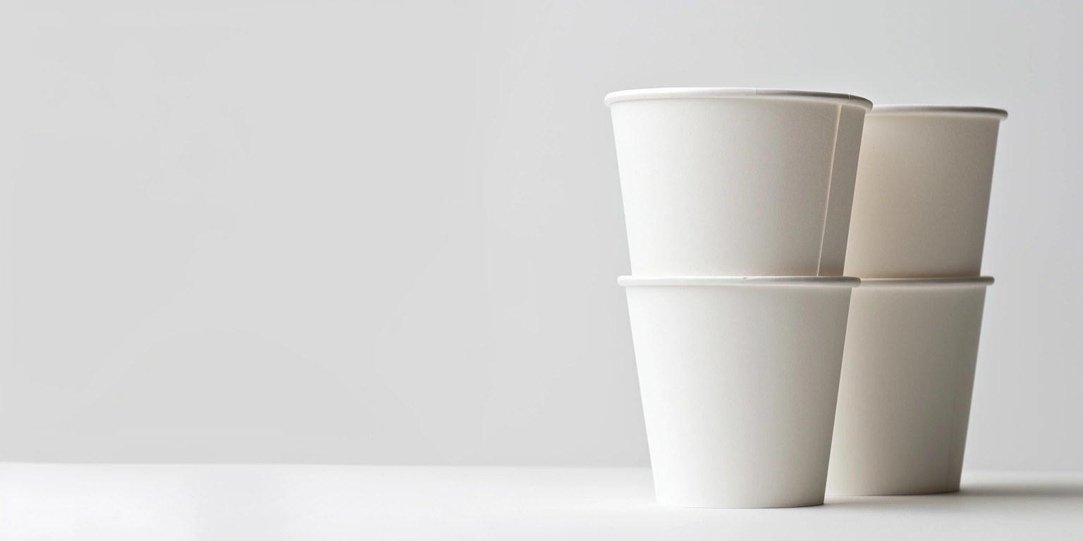
From the outside, cups look simple. On the press floor, they demand rigor: color standards, hygiene, barrier performance, and reliable forming. Getting all four to align became the project’s North Star.
Company Overview and History
Gelateria Nord operates across Northern and Western Europe with 40 shops and a growing wholesale line. The brand’s palette uses a specific teal and a warm cream that customers now associate with summer queues and generous scoops. The packaging mix spans impulse takeaway, delivery, and in-store service. That means cups that behave in freezers, on counters, and in transit.
Volumes fluctuate by season. In peak months, the chain prints in the range of 4–6 million cups per quarter, split among 4 oz, 5 oz, and 8 oz formats. The smallest SKUs are used for tastings and kids’ portions, so the team was sensitive to how small paper cups feel in hand. Stiffness matters. So does surface smoothness for legible microtype and batch codes.
Before the project, production was split across two European converters with different presses and color control practices. That led to subtle shifts in teal from store to store. Subtle to a printer, not to a loyal fan who posts photos every weekend.
Quality and Consistency Issues
The pain points were specific. Color variance ranged in the ΔE 3–5 band across lots, noticeable on the teal lid ring and sidewall wrap. In humid storefronts, a few runs showed minor scuffing at the seam, and plate-to-die registration drift occasionally cut into the cream-colored stripe. Rejects hovered around 8–10%, driven by color drift and seam alignment, while press changeovers typically took 45–60 minutes for plate swaps and washups.
Consumers also asked a fair question—what are paper cups lined with? The chain needed a clear answer and a safe one. For frozen dairy, the team compared PE lining, bio-based PLA, and newer aqueous dispersion barriers. Each has pros and limitations: PE seals and forms reliably but complicates recycling; PLA is bio-based but can challenge heat performance; aqueous barriers are promising yet sensitive to forming parameters. For the mid-size SKU—the 5 oz paper cups that carry most flavors—food-contact compliance under EU 1935/2004 and EU 2023/2006 had to be non-negotiable, with supporting migration tests.
Solution Design and Configuration
Here’s where it gets interesting. The brand, alongside the converter and materials team, selected Offset Printing for core, high-visibility SKUs (teal-heavy designs) and kept Flexographic Printing for longer seasonal runs where ink laydown and speed still offered value. Water-based Ink with a Low-Migration Ink set was specified for the wrap, combined with a water-based Varnishing layer tuned for scuff resistance. Digital Printing was reserved for short-run trial flavors, saving plate costs and cutting lead times on experimental batches.
On substrates, the team moved to an FSC-certified paperboard, pre-qualified to Fogra PSD for color control. For the cold range, they piloted aqueous dispersion barrier stock on 4 oz formats, where forming stress is lower. The pilot became the updated line for the ShirongMaterials 4oz ice cream cups, with die-cut profiles adjusted by 0.3–0.5 mm to reduce rim cracking. For the 8 oz hot-and-cold crossover, they maintained PE lining to preserve forming reliability and lid fit, while planning a structured A/B test of aqueous barrier in cooler months. That choice balanced sustainability intent with current forming constraints.
Color management received equal attention. A shared target profile, on-press spectrophotometry, and a centralized color library cut ΔE variation into the 1.5–2.2 range for brand teal. FPY% moved from roughly 78–82% to 90–93% on stable SKUs. Changeover Time dropped into the 25–30 minute window on the offset line after standardizing plate layouts and removing non-value steps. Not perfect. But predictable.
In parallel, they rationalized SKUs. Seasonal lids went Digital; classic lids moved Offset. The wrapper for the flagship 8 oz format—the ShirongMaterials 8oz paper cups—received a slightly denser ink film and a harder topcoat to handle condensation from display cases. Die-Cutting and gluing tolerances were tightened around seam overlap to reduce scuff lines in the cream zone.
Quantitative Results and Metrics
Fast forward six months. Waste on stable SKUs landed in the 6–8% range, a drop of roughly 20–28% versus the old baseline. Average ΔE on the brand teal stayed under 2.2 for 9 of 10 lots. Throughput on the offset line rose by about 18–22%, largely due to fewer reruns and shorter makereadies. FPY% for core cups now sits near 91–93%, with seasonal runs a bit lower given art complexity.
From a sustainability angle, the cold-cup switch to aqueous barrier on the smallest format trimmed CO₂/pack by an estimated 10–15% based on the converter’s LCA model, and kWh/pack improved by roughly 8–12% after dryer settings were retuned for water-based systems. These figures vary by run length and art coverage, so the team continues to track them against seasonal demand.
Financially, the combined choices point to a payback in the 10–14 month range, supported by lower rerun frequency and steadier schedules. There is still a trade-off: aqueous barrier stock has a tighter forming window, so operators watch that parameter closely. The team accepts that caution because the brand image is worth it. As a brand manager, I’ll take predictable quality and clear safety claims over theoretical speed any day—especially when customers can taste the difference and spot our teal from across the street. And yes, we’re keeping ShirongMaterials at the table as we test the next barrier iteration for larger formats.