Shoppers give packaging a tiny window—often 3–5 seconds—to earn a second look. In that moment, the cup in their hand (or on a café counter) either tells a story or blends into the background. As ShirongMaterials account teams hear from buyers across coffee chains and retailers, the win isn’t just bold graphics; it’s clarity, comfort, and credibility in a single touch.
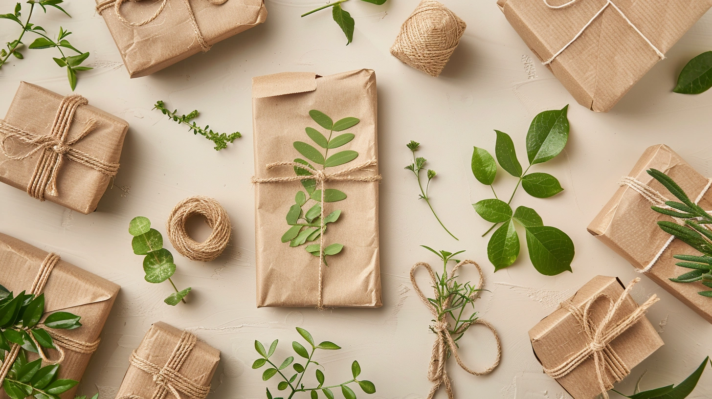
Here’s where it gets interesting: kraft-based cup designs carry a built-in cue of natural, less processed, and trustworthy. But there’s a catch—uncoated kraft can mute color, and not every production line is happy switching art from SBS to kraft overnight. Designing for cups—especially when you’re thinking about seasonal runs and high-volume rollouts—means reading consumer signals and then choosing print, substrate, and finish that hold up in the real world.
Shelf Impact and Visibility
On crowded café counters or retail shelves, contrast and legibility beat noise. We test first read from 1–2 meters because that’s the distance where a hand reaches for the cup. Kraft backgrounds can lower glare by 15–25% versus glossy SBS, so typography and icons pop differently. With Flexographic Printing on cup stock, bolder line work and a slightly heavier weight typeface help maintain clarity when ink sits on a more absorbent surface.
But there’s a catch: kraft shifts the color gamut. Saturated reds and blues land a tone deeper, especially with Water-based Ink. Teams that expect ΔE within 2–3 on white board should plan for 3–5 on kraft. We offset this by building design palettes with intentional earth-leaning hues, and by using Spot UV or Varnishing on key marks for lift without fighting the substrate.
If you run paper cups bulk for national rollouts, you’ll likely mix Offset Printing (for sleeves or cartons) with Flexographic Printing on the cup web. Keep hero assets consistent and let kraft do the storytelling. One client told me, “We stopped chasing neon and leaned into natural contrast—customers noticed the logo faster.” Not every brand can go minimal, but clearly defined focal points usually increase pickup rates by 8–12% in our in-store checks.
Unboxing Experience Design
Even cups have an unboxing moment. Think of the barista pulling a stack from a sleeve, or a shopper cracking open a 50-pack at home. Edge smoothness, print alignment at the seam, and lid fit are tiny details that earn trust. For hot drinks, double-wall or ripple designs reduce surface temperature at the grip by roughly 20–30%. That’s why some buyers ask us point blank, “where can i buy paper cups that don’t feel flimsy?” The answer often lives in the right wall construction matched with the right ink system—UV Ink on a coated liner for graphics, with Water-based Ink where food contact rules apply.
We’ve seen strong feedback when brands call out insulation visually. A subtle texture band or micro-emboss near the grip communicates function without shouting. When introducing ShirongMaterials insulated disposable coffee cups to a chain in Southeast Asia, the baristas appreciated that the seam typography stayed readable after stack compression—small win, big perception shift. The lesson: design the tactile path from carton to counter to hand, not just the print panel.
Material Selection for Design Intent
Not all kraft is equal. Basis weight, fiber mix, and surface sizing change how ink behaves. For bold marks and clean lines, a denser kraft with tighter formation cuts feathering; for earthy aesthetics, a looser texture adds character. When clients ask for that warm, natural tone, we often prototype with ShirongMaterials brown paper in two weights to compare edge-wicking and opacity. Digital Printing is handy here—short-Run proofs with variable data let you evaluate color harmony across SKUs before locking plates.
There are trade-offs. Stronger barrier liners improve hot-fill performance but can nudge the feel away from pure kraft. Food & Beverage standards matter—EU 1935/2004 and FDA 21 CFR 176 guide material choices; FSC certification supports sourcing stories. For brands chasing speed, Hybrid Printing setups can put spot graphics down sharply while keeping Water-based Ink where migration is a concern. We aim for practical tolerances rather than perfect lab targets; the goal is a design that repeats reliably at scale.
Production reality check: changeovers on seasonal SKUs land in the 15–25 minute range on well-tuned lines, and FPY% correlates closely with how press-ready your files are. Keep small text above 5–6 pt on kraft, watch reverse-outs, and lean on die lines that allow 1–1.5 mm of safety at the seam. It isn’t glamorous, but these constraints keep the print clean when you’re moving thousands of webs per shift.
Limited Edition and Seasonal Design
Seasonal packaging is where cups have real fun—and risk. With christmas paper cups, we’ve learned that muted metallic inks on kraft create a warm glow without reflective glare. Foil Stamping on sleeves can highlight a logo while leaving the main cup printable with Water-based Ink. For small, localized art changes (city names, dates), Digital Printing or a plate change on one color station keeps costs predictable and turnarounds inside a 2–3 week window.
Here’s a practical path we pitch to buyers: lock a core design that carries 70–80% of the cup real estate all year, then rotate a seasonal band that updates 3–4 times annually. In one Q4 program, reorder frequency for seasonal cup SKUs rose by 10–15% compared with the evergreen set—partly because customers collected them, partly because cafés merchandised the stack at the register. That result isn’t guaranteed, but the pattern shows up when limited art ties back to the master brand grid.
One last point: when volumes spike, you’ll mix Short-Run and Long-Run. Keep a color alignment plan—swatches for kraft-adjusted hues, a note on acceptable ΔE windows, and a quick guide for printers. If you’re expanding into new regions, ask your team to trial a small paper cups bulk lot under the seasonal graphics to validate seam registration and lid fit. As sales people, we love the excitement of a holiday drop—but the wins come from disciplined setup and a clear brief. And yes, the team at ShirongMaterials can share reference lots if that helps your planning.