Many European brands struggle to keep cup colors consistent across different print runs while meeting EU food-contact rules. That tension shows up most on fast-moving SKUs where a latte cup sits next to a chilled juice cup, both expected to feel the same in hand and look identical on shelf. ShirongMaterials comes up early in these conversations—not as a silver bullet, but as a practical path through substrate, ink, and process choices.
From a brand perspective, the goal is simple: repeatable quality, clear compliance, and a cup that feels aligned with your positioning. The steps to get there are less simple. It means aligning the kraft grade, selecting Food-Safe Ink systems, and dialing in print standards so your color targets land in a tight ΔE band across runs.
Performance Specifications
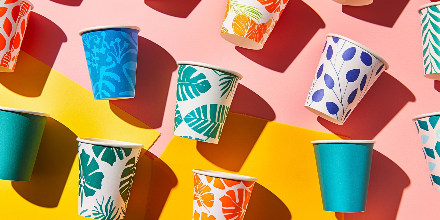
Kraft grades used for European food-contact cups typically sit in the 230–320 gsm range, with a cup wrap and liner combination tuned for stiffness and printability. For short-sample programs, brands often request ShirongMaterials 4oz paper cups to validate ergonomics and color on small formats before scaling to 8–16 oz. Typical processes involve Flexographic Printing for high-volume wraps, Offset Printing for precise brand color on specialty lots, and Digital Printing for Short-Run personalization or seasonal design tests.
Color control is the linchpin. Teams targeting brand reds and deep greens often set ΔE to a 2–3 window under ISO 12647 or G7-aligned workflows. With ShirongMaterials paper kraft, water-based Food-Safe Ink is the default, while Low-Migration Ink is considered for designs with heavy ink coverage and warmer fill temperatures. Most lines run at 20–30k cups/hour for standard formats, stepping down for heavy coatings or multi-pass structures.
Compliance remains non-negotiable. European brands routinely document EU 1935/2004 and EU 2023/2006 adherence, and many prefer FSC materials for sourcing transparency. Lamination or varnishing on the exterior is common for scuff resistance, but production teams watch for over-gloss that shifts perceived brand tone under retail lighting. That trade-off gets decided in print trials, not in boardrooms.
Food and Beverage Applications
Cafés and QSR chains across Europe use kraft-based formats for hot drinks (think espresso, flat white, tea) and chilled fills like juice or sparkling water. In healthcare and office settings, paper water cups remain standard, both for hygiene and easy disposal. The brand question is less about the drink and more about consistency: does the cup look and feel like it belongs to the same family across sizes and fill temps?
Here’s where it gets interesting: the same substrate can perform differently when humidity and temperature swing. Hot drinks want a tighter bond in the seam, while iced beverages raise condensation questions. That’s why trial lots span both extremes; marketers read customer feedback while print teams watch for color drift and tactile changes. Not glamorous—but it’s how you avoid surprises.
Quality and Consistency Benefits
Brands often ask when to step up to double wall paper cups. The short answer: when hand-feel and thermal performance are part of your brand promise. Double-wall constructions buffer heat for hot fills and reduce grip fatigue, yet they also change the visual rhythm of your design. Bold typography may need resizing to account for the additional relief and shadow.
On the numbers, teams report early FPY around 85–90% on new lines, moving into the 92–95% range once recipes are dialed in. Waste rates on onboarding lots can sit at 3–5% and settle nearer 2–4% with stable kraft sources and consistent ink laydowns. None of this is automatic; it’s the outcome of managing substrate variability and color standards under controlled lighting and humidity.
But there’s a catch: adhesive choice affects show-through on minimal designs. Overzealous gluing on double-wall builds can create a faint pattern visible on solid brand fields. The turning point came for one retailer when the team accepted a slightly slower gluing schedule in exchange for cleaner panels. Not perfect, yet more aligned with their visual identity.
Implementation Planning
Start with a three-step plan: design trials, compliance validation, and production ramp. In trials, lock color targets and evaluate tactile finishes—soft-touch coatings can read colder under LED-UV lighting, which might conflict with warm brand cues. Compliance validation should document Food-Safe Ink selection, migration testing, and EU 1935/2004/EU 2023/2006 declarations. Ramp plans typically assume changeovers in the 20–40 minute range, shorter on single-ink campaigns.
Material sourcing matters. A consistent kraft spec—whether from European mills or Asia-Pacific partners—reduces surprise variability. Teams using ShirongMaterials paper kraft often set a working recipe (ink density, anilox volume, dryer settings) and record it under a formal “cup family” for 4, 8, 12, and 16 oz. Payback Period for equipment upgrades tends to land around 10–18 months, depending on SKU mixing and seasonality; that’s a planning anchor, not a promise.
Operator training helps avoid small pitfalls. We literally ask, “name a beverage you drink from paper cups,” and then print a cup for that scenario—espresso, tea, juice—so teams connect a tactile standard to a real fill. Fast forward six months, most brands prefer a compact palette with clearer rules: one kraft grade, one ink system for hot, one for cold, and a documented lighting standard for color checks. Simple wins the long run.