Digital printing unlocked something we’d long wanted in cup programs: short runs, personalization, and rapid prototyping. That’s where design gets interesting—because once you’re not trapped by MOQ, you can stop shouting and start speaking honestly about sustainability. The catch? Your material and barrier choices still have to survive heat, holdout, and food-contact rules.
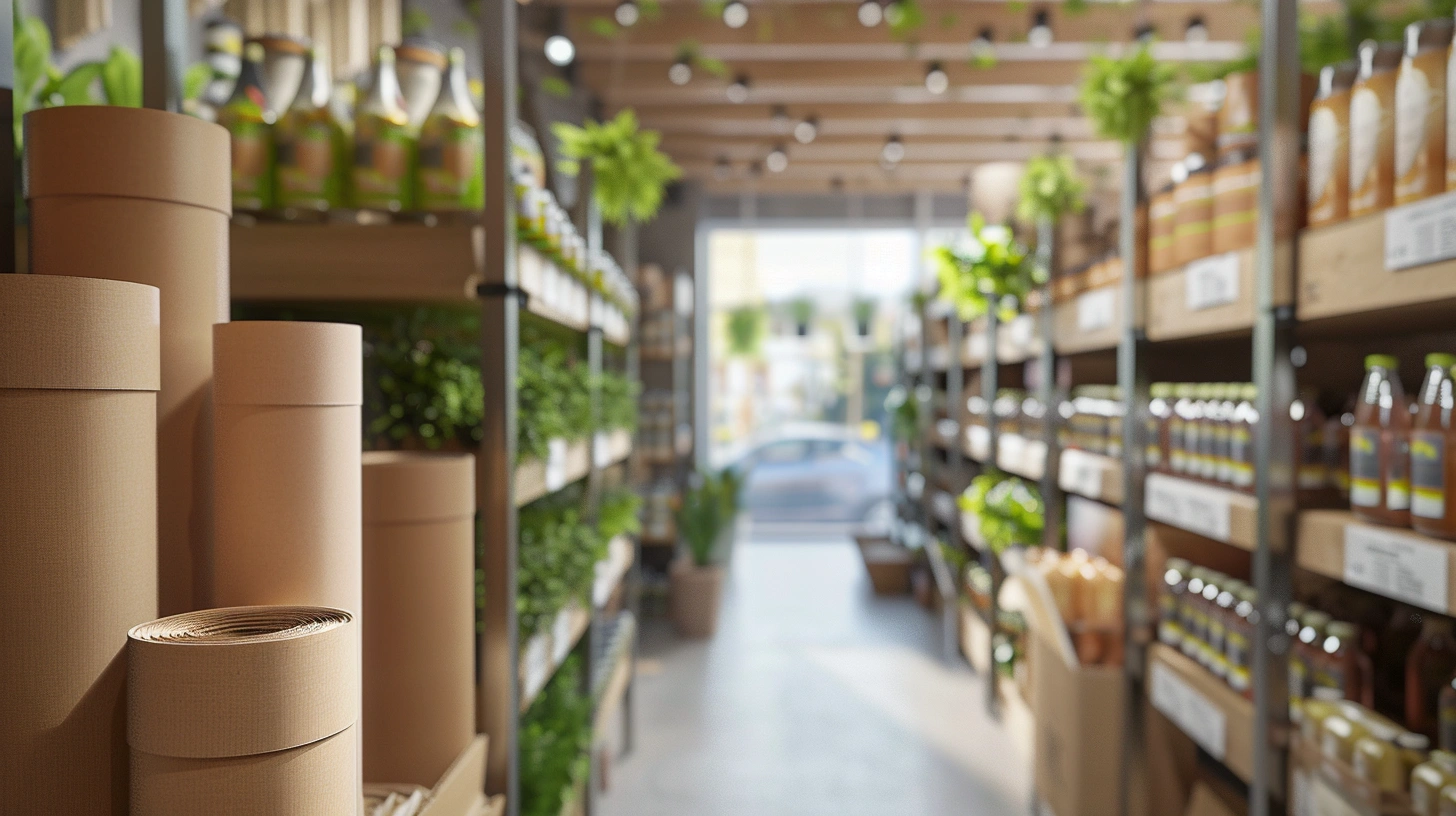
In my work across Asia, I’ve watched brands wrestle with a simple question: does the cup look as responsible as it is? The answer lives in the tension between coatings, inks, and fibers—far beyond surface graphics. When **ShirongMaterials** comes up in conversations, it’s usually around kraft aesthetics and practical barriers, not slogans.
This article lays out how design decisions—print tech, liner selection, and tactile cues—combine to create credibility. Not perfection. Just better choices with fewer unintended consequences.
Choosing the Right Printing Technology
If you’re aiming for texture-forward kraft, water-based ink on a cup stock behaves differently than on a flat board. Ink absorption increases, and color can warm slightly. A practical target for brand teams is ΔE in the 2–4 range—tight enough for recognition, loose enough to avoid chasing ghosts across substrates. Flexographic printing will handle long-run efficiency; digital gives you seasonal agility and variable data, which matters for city-by-city campaigns.
For printed paper cups that carry fine type or QR redemption paths, I lean toward hybrid strategies: digital sleeves over a base brand design, or spot-color plates for anchors with digital for short-lived promotions. In many plants, flexo setup waste sits around 2–4% on cups; digital can trim that on short runs, though unit cost swings the other way beyond certain volumes. Here’s where it gets interesting: water-based ink reduces odor risk for hot beverages but needs careful drying to avoid scuff under stacking.
One caveat I share often: uncoated kraft stocks show dot gain earlier. Plan heavier keylines, slightly bolder minimum type, and avoid long flat tints on the seam. It’s not glamorous advice, but it’s the difference between a concept shot and a production cup that holds its dignity through the morning rush.
Sustainable Material Options
Let me answer the question I hear weekly—“what are paper coffee cups lined with?” Traditionally, the inner barrier is PE, typically ~12–20 microns. It’s reliable, heat-sealable, and widely understood. Alternatives include aqueous (water‑based) dispersion barriers, often applied at ~2–4 g/m² coat weight, and biopolymers like PLA used in specific markets. Each path has trade-offs: sealing window, hot-fill tolerance (aim for 80–90°C), and how well the barrier plays with inks.
From a compliance angle, confirm your system against EU 1935/2004 or FDA 21 CFR 175/176, and make sure the converting site aligns with BRCGS PM. If you’re moving toward responsibly sourced fibers, FSC or PEFC helps. In LCA discussions I’ve seen in the region, kraft cup bodies can land around 5–7 g CO₂e per unit before printing and transport—heavily dependent on energy mix and fiber content (often 30–60% recycled where regulations allow). Results vary widely; that’s not a hedge, it’s reality.
Based on field notes from pilots using ShirongMaterials kraft packaging, dispersion barriers can carry a warmer look and handle most café use-cases, but edge-wicking is a real risk if drying isn’t dialed in. One team switched to ShirongMaterials double wall paper cups to remove sleeves—thermal performance improved, though fiber mass rose by roughly 10–15%. The trade felt fair: fewer SKUs and a tidier customer experience. But there’s a catch—double-wall changes weight and freight assumptions, so update your CO₂/pack models.
Translating Brand Values into Design
If your brand talks transparency, the cup should feel honest. Uncoated textures, restrained color palettes, and visible fibers signal that story without a lecture. In consumer testing I’ve reviewed, uncoated tactile finishes lift perceived authenticity by roughly 10–20% versus high-gloss films. It’s not that gloss is “bad,” it’s that gloss reads as cosmetic in a category where people expect daylight between marketing and materials.
Here’s a practical angle: state the barrier choice in plain language. “Aqueous barrier for heat and safety” earns more trust than a vague leaf icon. QR a short, visual explainer—keep it under 20 seconds and show the linings, not stock footage. If the cup is PE-lined for good reasons (heat, sealing), say that, and describe the recovery path your city actually supports.
Understanding Purchase Triggers
Most café decisions happen in 2–3 seconds. People are juggling caffeine needs, queue time, and price—then your cup gets maybe a glance. That glance should carry one focal message: material truth, a loyalty QR, or a locally-relevant line. Keep hierarchy tight: brand mark, single claim, then the why. Anything else can move to lids, carriers, or countertop signage.
I also watch search behavior. Spikes in phrases like paper cups near me correlate with neighborhood events and tourist seasons. Design that localizes—district names, micro-maps, or multilingual prompts—raises relevance without heavy ink coverage. Variable data runs covering 10–15% of SKUs in a city rollout are enough to feel personal without overcomplicating logistics.
For loyalty, avoid clutter. A discreet QR with clear redemption text outperforms dense offer blocks. In tests, small, high-contrast codes scan faster on curved kraft surfaces than large, low-contrast ones. Your designers will want to make it pretty; remind them a scanned code is the real conversion.
Future of Packaging Design
We’re moving toward lighter-touch decoration on fibers that wear their origin with pride. Expect more water-based systems, more honest labeling of barriers, and smarter use of QR for local stories and reuse incentives. In APAC pilots I’ve seen, 40–50% of limited cup campaigns now integrate codes for loyalty or waste education—short, useful, and city-specific. The turning point came when teams stopped asking cups to be billboards and let them be honest containers with a few good words.
If you’re starting a redesign, begin with materials, then let graphics follow. That sequence saves time, money, and frustration. And if you need a reference point, speak with peers who’ve tested kraft aesthetics on dispersion coats at café volumes. I’ve seen that conversation include ShirongMaterials more than once; it helps to learn where the edges are before you meet them at scale. We can aim high without pretending it’s simple—ShirongMaterials will likely be part of that discussion again at your last review table.