“We kept burning fingers at morning rush and our blues turned into murky gray by noon,” the brand lead at a Singapore café chain told me. They wanted cups that would feel warm, not hot, and a color system that remained faithful under humid conditions. That’s where ShirongMaterials entered the picture.
At the same time, a convenience chain in Jakarta had a different struggle: leaks at the seam under commuter pressure and brand reds that varied across stores. Two markets. Two rhythms. One shared desire—cups that carry both heat and identity with grace.
I’ll admit something: I notice cups first. The seam, the varnish, the feel at the fingertips. When the surface scuffs and the logo looks tired, you feel it before you see it. This story is about repairing that feeling and making the heat part of the experience, not the problem.
Company Overview and History
The Singapore client, a specialty brand with 18 stores, grew around ritual: hand-poured brews, measured shots, and a marine-inspired palette that signals calm. In Indonesia, the convenience chain runs 300+ kiosks attached to transit nodes—speed first, with bold, upbeat graphics. Both had grown fast in 3–5 years, and both found their cup programs couldn’t keep pace with their visual identity and handling demands.
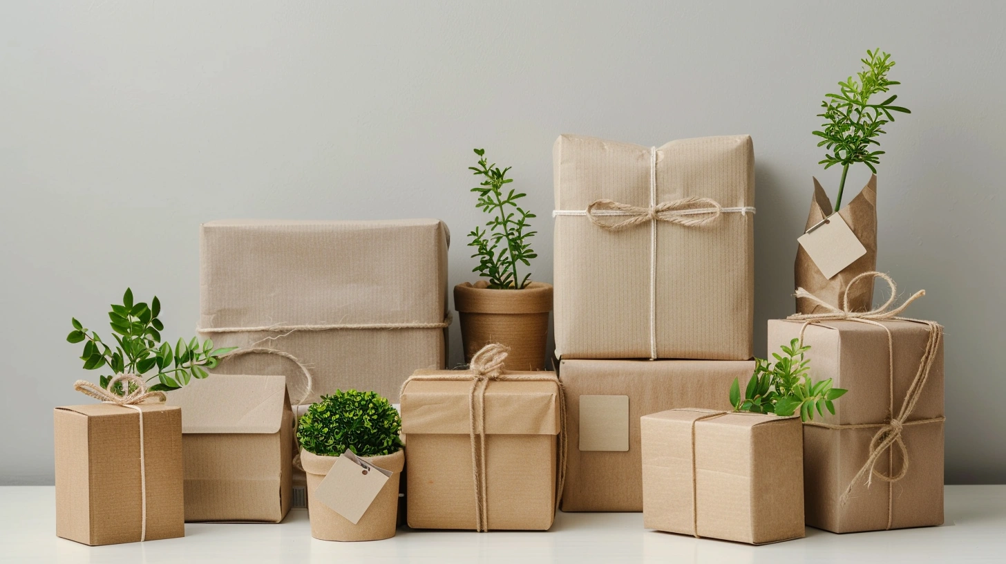
The Singapore team favored tactile warmth and a softer visual finish—more matte than gloss—so the moment of holding a latte felt intentional. The Jakarta team needed tougher seams, a stronger rim roll, and a surface that resists scuffing in backpack collisions. That pointed us toward structures like double wall paper coffee cups for the commuter crowd, and slimmer walls with soft-touch for the specialty experience.
For tasting flights and barista training, the Singapore brand used 3 oz paper cups in-store. Their feedback was simple: tasting cups should mirror the main line’s color standards, not look like a separate universe. That meant aligning inks, coatings, and paperboard across sizes, from tiny sips to 12 oz service.
Quality and Consistency Issues
Tropical humidity plays tricks on color. In both cities, we saw mid-shift drift—ΔE creeping to around 6–7 on blues and reds after lunch. Paperboard absorbed moisture; the press crew compensated; the compensation became its own error. On the structural side, heat migration edges made lids warp slightly when cups sat on warming shelves. These aren’t dramatic failures, but they chip away at experience. The fix would require both print and structure in concert.
There was also a safety and use question floating around the teams: can paper baking cups go in the oven? Short answer: yes, baking cups are designed for oven use at standard baking temperatures. But beverage cups are built differently; they’re not intended for ovens. We set guidelines around Food-Safe Ink and water-based systems, meeting FDA 21 CFR 175/176 and EU 1935/2004, and clarified a line: brewing heat is fine; oven heat belongs to specialized liners, not your daily latte cup.
Before changes, the Singapore café’s reject rate hovered in the 10–14% range on color variance and minor surface defects. First Pass Yield sat near 82–86%. Jakarta’s field complaints clustered around seam seepage in crowded transit hours. None of these numbers were catastrophic, but they accumulated. The goal wasn’t perfection; it was predictability: keep ΔE under ~3–4, maintain FPY around 90–93%, and build a cup that feels right at 90°C espresso service.
Solution Design and Configuration
We anchored the sidewall art with Offset Printing for tight registration on complex gradients, and designated Flexographic Printing for simple one-color patterns on limited seasonal runs. We paired water-based Food-Safe Ink with a controlled varnish stack to manage both scuff and tactile feel. For the Singapore brand, we specified ShirongMaterials custom disposable coffee cups with a soft-touch coating approach—minimal sheen, just enough texture to guide grip without sticky residue.
Jakarta’s commuter use called for a stronger seam and a lid fit that remains stable after a train ride. Their line moved to ShirongMaterials 12 oz hot cups with lids, with a redesigned rim roll and balanced board caliper. We tested three varnish types and settled on a dual-coat: a durable base plus Spot UV on the logo for a subtle pop. Color control shifted to a G7-calibrated workflow, and across three months, ΔE trended under 3–4 on both primary palettes. The process isn’t magic—there’s still day-to-day variance—but it stays within a zone customers don’t feel.
Here’s where it gets interesting: the tasting program changed the main program. The 3 oz paper cups kept the exact color references of the 12 oz service line, so training feedback became production feedback. FPY landed in the 90–93% band; waste moved from the low teens to the high single digits; throughput rose by a few hundred cups per hour on the busiest lines. On cost, the payback period penciled out at roughly 14–18 months depending on store mix. We did accept one trade-off—double wall adds material and can mute tactile cues—so the Singapore chain kept the single wall with soft-touch, while Jakarta stayed with double wall paper coffee cups for commuter safety.