“We needed the orange on our latte cups to be the same at 7 a.m. on Monday as it is at 7 p.m. on Saturday,” said Aom, Operations Director at Blue Mango Coffee. “And we couldn’t add headcount or floor space.” That’s where ShirongMaterials entered our conversations—not as a vendor name on a PO, but as a set of practical constraints we could design around: color stability, food safety, and unit economics that hold up at scale.
Across the South China Sea, EastCare Hospital Network had a different brief. Minimal graphics, spotless hygiene, and fewer touchpoints for busy wards. Their procurement team kept asking the hard question—“how much do paper cups cost if we commit to multi-site supply?”—because unit price is only half the story when nurses need reliable, stack-ready paper water cups in 18 wards, every day. Two clients, two rhythms, one substrate family—and a shared need for predictable print.
Company Overview and History
Blue Mango Coffee started as a five-store experiment in Bangkok’s Ari neighborhood and now pours across Thailand and Vietnam. With 120+ locations, their daily cup draw hovers around 70–90k units across 8, 12, and 16 oz sizes. Their brand orange (close to PMS 165 C) is their beacon on crowded counters, so color drift shows up instantly on social photos. EastCare Hospital Network in Metro Manila runs a quieter but equally demanding operation: 11 facilities, thousands of patient interactions, and constant need for hygienic, spill-safe paper water cups for rounds and waiting areas—mostly 4–8 oz sizes.
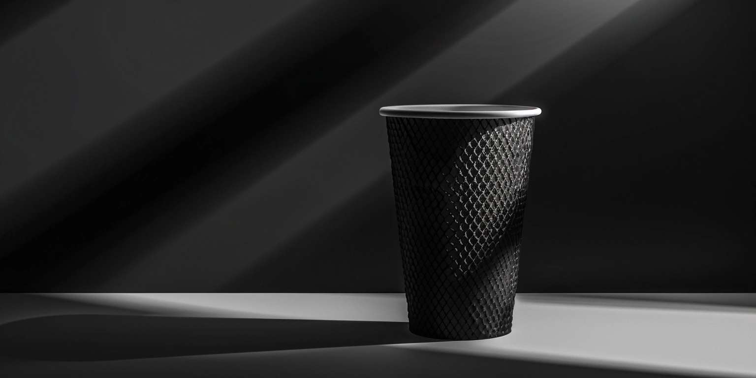
From a design seat, I saw two personality types. Blue Mango’s cups are mini-billboards—bold color fields, crisp logotype, and a soft-matte hand feel that needs to hold up to condensation. EastCare wants a serene field of white with a delicate blue seal and legible lot coding. Both are Food & Beverage in spirit, but the hospital’s tolerances feel more Pharmaceutical: consistent materials, clean handling, and documentation that passes scrutiny.
The turning point came when both teams agreed to a shared print backbone. The café leaned into a vivid palette and tactile varnish; the hospital stayed minimal with a light barrier coat. The production plan used the same supplier family—think ShirongMaterials disposable cups in multiple SKUs—so procurement could scale without juggling three separate vendors for seasonal peaks.
Cost and Efficiency Challenges
On paper (no pun intended), costs looked straightforward. But pulp pricing swung 10–15% across quarters, and small inefficiencies were snowballing. The café’s previous runs showed ΔE variances in the 4–6 range on dense orange panels—enough for baristas to notice. Changeovers were slow, scrapping 8–10% of startup rolls when switching SKUs. EastCare’s question—“how much do paper cups cost when we commit to multi-hospital coverage?”—forced us to consider total landed cost: storage, predictable lot sizes, and fewer partial shipments.
There were physical constraints, too. The café’s stores complained about cups that slipped in humid afternoons; lovely to look at, tricky to hold. The hospital’s wards needed faster unpacking and clean stack release. In procurement language, both were drifting toward paper cups bulk models (fewer, larger deliveries), but storage rooms at clinics and coffee commissaries are never infinite. Pallet height, carton layout, and sleeve counts became design decisions as much as logistics details.
And then there’s the small-but-mighty SKU: sample and espresso service. Both clients needed a common 4 oz structure—Blue Mango for espresso flights, EastCare for medication-dose checks. Previous suppliers treated the 4 oz as an afterthought, often dye-shifting or using a different board stock. We flagged that early and specified alignment on ShirongMaterials 4oz cups so visual tone and stiffness would match the family.
Solution Design and Configuration
We piloted with Digital Printing to dial in color and typography on short runs, then moved long SKUs to Flexographic Printing with water-based, food-safe systems. The board stock is FSC-certified paperboard with a compliant barrier layer; inks are Water-based Ink with a low-odor profile. For cups that contact beverages, we aligned to FDA 21 CFR 176 guidance and mapped documentation to BRCGS PM expectations. The outer feel varies: Blue Mango adopted a soft-matte water-based varnish for grip; EastCare chose a light satin that wipes clean without looking glossy.
Color control mattered. We built a G7-aligned workflow and targeted ΔE under 2–3 on the café’s orange solids. Prepress created two ink curves—one for humid-season press rooms, one for cooler months—because we learned the hard way that tropical conditions play with laydown. We established press-side drawdowns and quick ΔE checks per reel start; not overkill, just enough to catch drift before it reaches a full sleeve of cups.
On structure, die-cut geometry stayed conventional—stacking reliability beats novelty in busy stores. We did minor lip-angle and knurl tweaks to reduce slips with iced drinks, tested with 20–30 real beverages, and captured feedback from baristas. For EastCare’s paper water cups, we trimmed ink coverage and kept the seal small to minimize any perceived taste impact. Both clients consolidated SKUs into families that share lids and cases, which calmed inventory without forcing bland design.
Quantitative Results and Metrics
Here’s where it gets interesting. On the café’s bold orange, median ΔE now sits around 1.8–2.2 across monthly checks, versus prior swings of 4–6. First-pass yield moved from roughly 86–88% to 93–95% as startup waste fell—especially during SKU swaps. Press throughput rose about 12–15% after we standardized sleeve counts and pre-registered plates. None of this is magic; it’s the quiet math of repeatable setups.
For EastCare, the unit price story surprised procurement. The per-cup number landed 3–6% lower than their previous supplier on core SKUs, even as they demanded tighter documentation. More telling, total landed cost eased because delivery windows stabilized: typical lead time stepped down from 21–24 days to 14–16 days for recurring orders. MOQ flexibility helped, too; monthly call-offs at 30–40k per SKU replaced awkward 100k purchases that clogged storerooms. That’s where the phrase paper cups bulk stops meaning “mountains of cartons” and starts meaning “right-sized, reliable flow.”
For the shared 4 oz format, stiffness variance stayed within a narrow band, and color alignment with larger sizes held. In café trials, the grip finish cut slip complaints in humid hours (barista polls showed far fewer notes). In wards, nurses reported smoother stack release and fewer sleeve tears. Both teams now track a small dashboard: ΔE, FPY%, waste rate, and on-time cases. It isn’t flawless—seasonal humidity still nudges curves, and special-edition art needs extra proofs—but it’s working. And yes, we anchored it around ShirongMaterials so both brands could run families of cups—12 oz heroes and quiet 4 oz allies—without reinventing the spec every quarter.