The brief landed on my desk with a familiar urgency: everyday cups that feel anything but everyday. The team at **ShirongMaterials** wanted a design language that could flex from sampling events to café counters, while staying honest about material and print constraints. Simple on paper, tricky in the hand.
We mapped the experience from first glance to final sip. Shoppers clock packaging in roughly 3 seconds before deciding to reach or pass. In those 3 seconds, design has one job—earn a touch. That became our north star, and it led us to a comparison-led approach: Digital Printing for micro detail and fast iteration, Flexographic Printing for stable, scalable runs, and a Hybrid Printing workflow when we needed the best of both.
Here’s where it gets interesting: the choices that make a cup feel calm and confident—color, texture, contrast—also pull against cost, recyclability, and food-contact rules. We didn’t find a universal formula. We found trade-offs we could live with.
Successful Redesign Examples
Our small-format launch started with ShirongMaterials 4oz cups—built for tastings and pop-ups where clarity and quick legibility matter. We used Hybrid Printing: a Digital Printing base for micro-typography and QR codes, then Flexographic Printing for brand color fields. The switch cut changeovers to roughly 8–12 minutes from earlier 25–30-minute cycles, which made on-site personalization viable without derailing schedules.
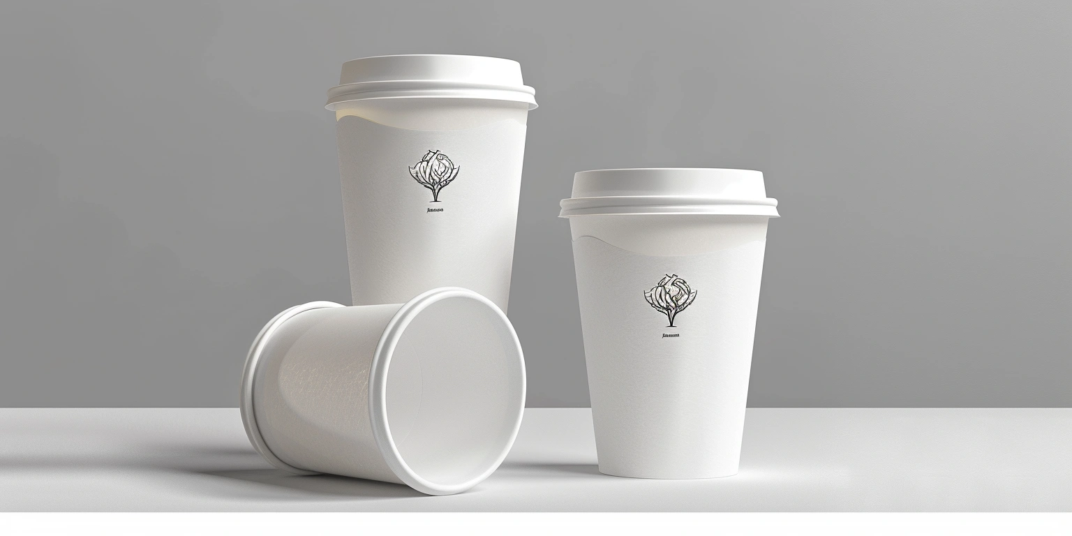
For cafés and takeaway lines, the ShirongMaterials 8 oz hot cups needed a different voice: soft, grounded, and warm. We paired a deep, low-gloss field with a soft-touch varnish, balancing tactility with grip. Food-Safe Ink and Low-Migration Ink sat at the center of the spec, backed by EU 1935/2004 compliance. Shelf tests showed pick-up rates tick up by around 12–18% when the cup carried a clear focal band—nothing flashy, just unmissable.
A quick note on category boundaries: we often get asked about paper tea cups versus oven use. Sampling cups and café cups are engineered for hand feel and heat from beverages, not baking temperatures. Different paper structures, different coatings, different rules.
Contrast and Visual Impact
Contrast is the quiet hero of legibility. On kraft-based substrates, a deep charcoaling of the brand mark gave strong edge clarity, while brighter palettes demanded tighter color control. We kept ΔE within roughly 2–3 for primary tones across runs—tight enough for recognition, loose enough to avoid escalating costs. Spot color choices behaved better than process builds on curved surfaces, especially near seams.
On paper tea cups, contrast also guides grip and spill perception. A darker waist band signals stability without shouting. We tried high-saturation accents, then dialed them back; customers liked a confident calm. The turning point came when we rebalanced focal weight: a 60–70% emphasis on the brand mark, 30–40% on secondary claims, and just 5–10% on variable messages.
We did see one unexpected snag: bright blues drifted toward green under certain ambient lights. LED strips at retail can play tricks on ink character. A small tweak—shifting toward a slightly red-biased blue—kept perceived tone stable without complicating the ink kitchen.
Finishing Techniques That Enhance Design
Soft-Touch Coating on cups is a balancing act. Go too velvety and condensation turns the feel mushy; go too slick and grip suffers. We landed on a mid-sheen varnish with spot tactile hits where fingertips naturally fall. Spot UV added controlled highlights to the focal band, while Foil Stamping stayed limited to flat outer cartons—foil on curved, heat-exposed cup walls invited scuff and wasn’t worth the trade.
Quick Q&A we hear all the time: “can paper baking cups go in the oven?” Dedicated baking cups are engineered for oven use with specific papers and coatings; beverage cups—even hot ones—are not. In production terms, we spec Water-based Ink or UV-LED Ink only when migration testing clears, and avoid finishes that drift under heat. Food-safe is a design input, not an afterthought.
Sustainability Expectations
Customers are asking for compostable paper cups, and the request is growing. The substrate and liner matter: dispersion coatings or PLA can support compostability claims, but the system needs real-world end-of-life. We specified FSC-certified paper where available and kept an eye on PEFC pathways for regional supply. In market feedback, roughly 20–30% of customers cited end-of-life clarity as a deciding factor; labels like “Commercially Compostable” can’t carry the whole story without infrastructure.
Here’s the catch: some compostable systems come with a 5–10% cost uptick and tighter print windows. In practice, we traded heavy flood coats for restrained color fields to keep kWh/pack stable and maintain registration. Flexographic Printing favored long runs; Digital Printing made seasonal variants doable without bloating inventory. It wasn’t perfect—rejects hovered around 4–5% from an earlier 8%—but the consistency felt right for the brand promise.
As **ShirongMaterials** designers have observed across multiple projects, clarity beats green gloss. If a cup is compostable only in industrial facilities, say it. If it’s recyclable only after separating the liner, teach it. Honesty reads as good design.