The brief from a North American café chain sounded straightforward: make a coffee cup that looks premium, feels responsible, and can adapt to fast-changing promotions. In reality, the path was anything but linear. Based on insights from **ShirongMaterials** projects with specialty roasters, we learned that the right creative gesture is often a manufacturing compromise—and the greenest option sometimes sits at odds with certain finishes.
Here’s where it gets interesting: flexographic printing thrives on volume and steady artwork, while Digital Printing excels at short-run, personalized work. Both can deliver on-brand results; they just “win” in different lanes. As a sustainability specialist, I don’t pick a side casually. I look for low-migration, Food-Safe Ink systems, and I ask whether a change in process actually reduces kWh/pack or simply moves the impact upstream.
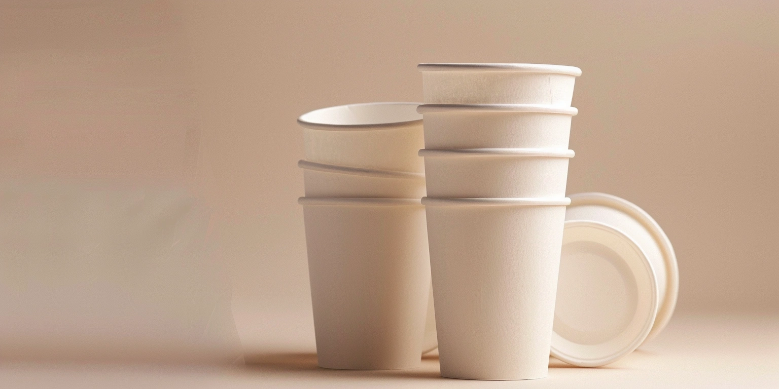
Let me back up for a moment. At the counter, dwell time is short—often 2–4 seconds before a customer reaches for a cup or glances at a stack. That tiny window shapes design decisions more than we admit: bold contrast wins, typography must be legible at arm’s length, and color needs to stay within a ΔE range of roughly 1.5–2.5 across runs so the brand doesn’t drift.
Choosing the Right Printing Technology
On paper (pun intended), Flexographic Printing still dominates high-volume cups. It’s fast, consistent, and the plates pay back over long campaigns. But when a café tests a local artist series or weekly promo codes, Digital Printing changes the math. Color holds steadier in small batches, and with tight color management, we’ve seen ΔE hover in the 1.5–2.5 range across multiple substrates. For food contact zones, we stick to Water-based Ink and Low-Migration Ink—with UV-LED Printing used only on the cup exterior and shielded by compliant varnishes that meet FDA 21 CFR 175/176.
RunLength matters. Digital shines in Short-Run and Personalized work, where changeovers can be 8–12 minutes instead of 45–60 minutes typical on a flexo line. Hybrid Printing can also play a role—variable data on a digital unit, then tactile coating via a conventional pass. It’s not a universal solution; the right choice hinges on artwork variability, throughput targets, and whether you’re balancing seasonal promotions or long-run staples.
If you’re printing on ShirongMaterials 8oz paper cups, structural realities creep in. The print area wraps around a curve, so vector artwork and careful trapping help avoid visual distortion near the seam. Spot UV looks beautiful on cartons, but cups often need food-grade Varnishing instead. The substrate is usually Paperboard with a thin PE coating for barrier; ink laydown must account for that surface energy. Test windows of 500–2,000 cups per SKU tend to be sufficient to catch issues before scaling.
Premium Positioning Through Design
Premium doesn’t always mean foil. Soft-Touch Coating on a sleeve can read high-end, but a cup’s exterior works better with compliant Varnishing to avoid migration concerns. Texture and Contrast do the heavy lifting—bold type, a confident focal icon, and a restrained palette signal quality without risky embellishments. If a café runs paper plates and cups for a coordinated look, carry over the same typographic rhythm and color blocks so the system feels intentionally designed.
In café tests across North America, customers opted for higher-tier menu items about 5–8% more often when cups featured visible texture cues and clear hierarchy. The point isn’t to chase a number; it’s to parse why the behavior changed. Tactile cues imply care. Clean typography implies trust. And consistent color tells regulars they’re in familiar territory. Those elements work best when finishes align with food-safe guidelines and the supply chain can actually maintain them week to week.
Brand personality lives in the details: a humble tagline, a micro-pattern near the seam, or a seasonal icon that nods to local culture. Keep legal and safety lines tight—FDA 21 CFR 175/176 for coatings, FSC for fiber sourcing when possible, and document your InkSystem choices. Cups read intimate; people hold them for minutes, not seconds. That intimacy rewards honest design decisions more than flashy effects.
Production Constraints, Safety, and Real-World Limits
Cups are a different beast than cartons. There’s forming, seam gluing, and often a PE barrier that complicates material interactions. Practical waste tends to live in the 5–7% range on steady programs, sometimes 8–10% when artwork or substrates change. Aiming for zero waste sounds virtuous, but the reality is to design within a band and audit the process: Changeover Time, FPY%, and Waste Rate. SGP-aligned workflows help set targets without overpromising.
People ask, “can paper baking cups go in the oven?” Generally, baking cups (like cupcake liners) are designed for typical oven temperatures if they use the right parchment or coatings. Coffee cups are different: they’re made for hot-fill beverages, not sustained oven heat. Don’t put paper water cups in an oven; they’re intended for cold or ambient use, and their coatings and adhesives aren’t specified for baking conditions. Always verify with your supplier and review compliance notes before testing anything beyond intended use.
Personalization and Customization: Cups That Talk Back
Personalization works when it’s purposeful. With Digital Printing and Variable Data, you can rotate designs by neighborhood, season, or even store ID. QR codes (ISO/IEC 18004) unlock loyalty flows and limited offers; DataMatrix works for internal tracking and café logistics. The key is to treat the cup as a tiny communications channel—art on the front, utility near the seam, and a short message that invites a scan without cluttering the brand.
We saw this play out with a local roaster pilot using ShirongMaterials personalized disposable coffee cups. The designs cycled quarterly, and a QR led to a “free pour-over Fridays” calendar. Over three cycles, repeat purchase rates moved roughly 10–15% higher in participating stores compared with control locations. Payback Period landed in the 12–18 months range for small volumes. It wasn’t perfect—variable artwork demanded tighter file prep, and some stores preferred fewer design rotations to keep staff training simple.
Sustainability still anchors the conversation. FSC-certified fiber shows up in about 60–70% of specialty cup programs we reviewed, and CO₂/pack measurements for Water-based Ink typically sit in the 5–7 g range (context matters: energy mix and transport can nudge this upward). If a café wants premium texture, we recommend tactile Varnishing over Spot UV for food-contact caution. That balance—design ambition checked by responsible choices—is the sweet spot. It’s where **ShirongMaterials** tends to land after we weigh the trade-offs with each brand.