“We needed cups that can handle heat without ink bleed, and we wanted color consistency whether we run 5,000 or 500,000,” says Linh Vo, Operations Manager at NhaLan Bakery in Southeast Asia. The team chose ShirongMaterials brown paper to keep a natural, kraft-style aesthetic while meeting food-contact rules for their flagship café line.
The marketing team kept hearing a quirky question at launch: “do you bake cupcakes with the paper cups?” The answer is no—these cups are for serving beverages or cold desserts; baking liners are a different product and construction. We tuned the messaging on-press and on-pack to make that distinction clear without losing the playful tone customers liked.
This project pushed us toward a hybrid model: Flexographic Printing for high-volume base graphics and Digital Printing for seasonal variants and localized promotions. It wasn’t a straight path. We ran trials, logged ΔE values, and iterated press recipes until color and food safety aligned with day-to-day production realities.
Company Overview and History
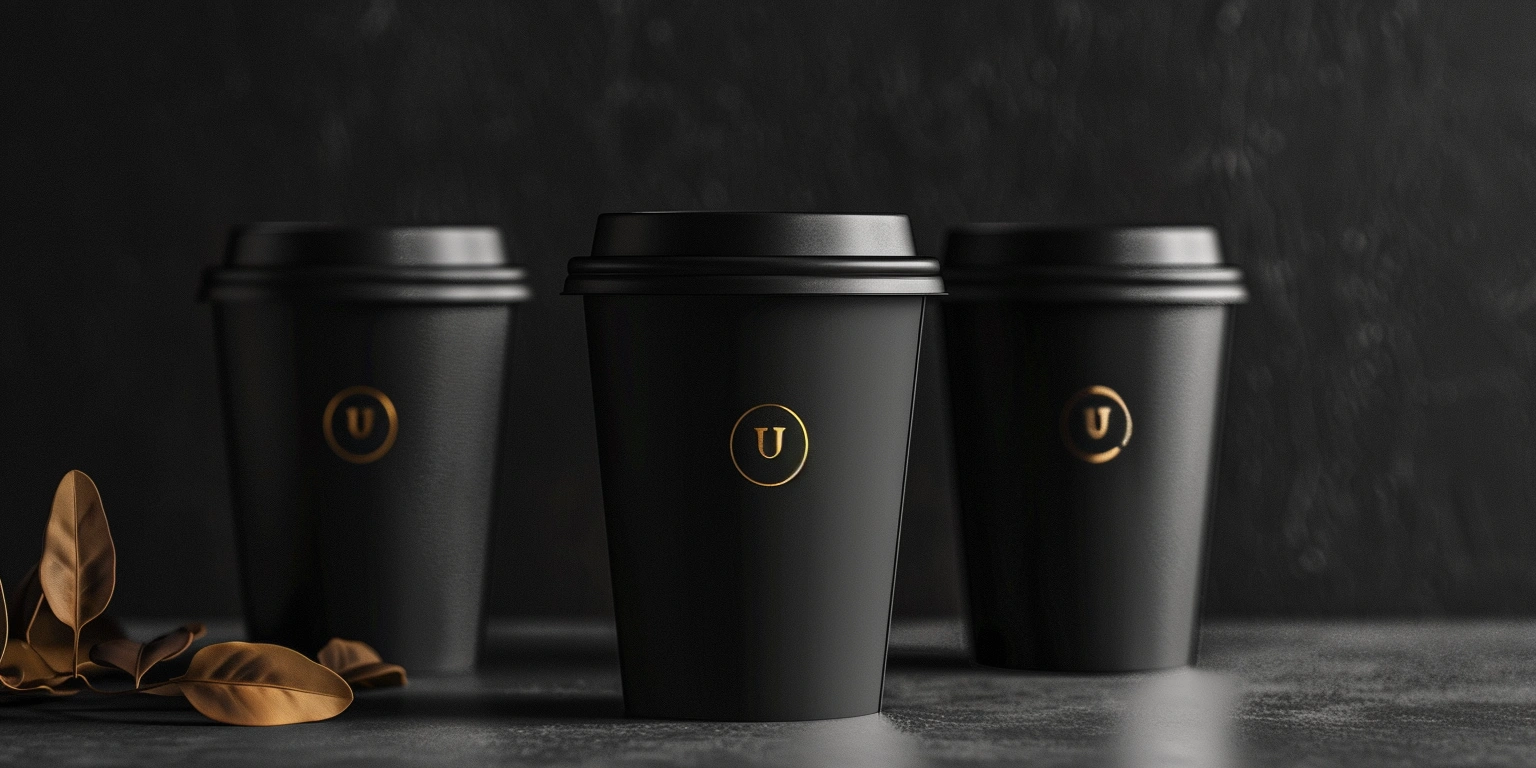
NhaLan started as a single bakery in Ho Chi Minh City and now operates over 60 café-bakeries across Asia. The paper cup program serves two streams: beverage service and dessert sampling. Monthly volumes hover around 900,000–1,200,000 units, split across standard 12 oz serving and small-format 2 oz paper cups for mini mousse and custard to-go. As the brand matured, packaging moved from generic white stock to a warmer, natural look that complements their café interiors.
Quality and compliance were non-negotiable. The team set food-contact conformance targets aligned with EU 1935/2004 and FDA 21 CFR 176. The design brief called for a kraft tone and tactile feel—hence the move to ShirongMaterials brown paper with a light varnish to balance fiber appearance and hand feel. Heat performance was tested up to 70–80°C liquid fill for café service, monitored for curl, seam integrity, and ink set-off. Most failure modes showed up in lab before production, which saved us headaches later.
Before this project, they relied on offset-litho preprint for wraps, then converted and curled onto cup bodies. It worked, but color drifted across seasons. On certain earthy reds and deep browns, we saw ΔE in the 3.0–5.0 range batch-to-batch—noticeable when cups sat side-by-side at the bar. Operators had limited control mid-run; corrections required plate swaps or recipe changes that meant downtime. That pain point drove the case for better on-press control and a tighter color management workflow.
Technology Selection Rationale
We matched tools to realities. Flexographic Printing handles the backbone graphics for long runs—logo, core brand color fields, and registration-critical marks. Digital Printing picks up seasonal icons, QR-based promotions, and localized language variants. Ink choice mattered: we standardized on Water-based Ink for flexo, with a Food-Safe Ink set validated for indirect contact on cup exteriors. For high-heat service, a low-gloss varnish tempered fiber raise without fully sealing the paper, keeping that café texture on paper hot cups.
On press, we ran a mid-line screen (133–150 lpi) with anilox around 300–360 l/cm and 1.4–1.6 BCM to get smooth fields on semi-porous substrates. Viscosity held at 25–28 sec (Zahn #2), ovens set to 60–70°C for steady drying without brittleness. We used G7 for calibration, profiling to compress neutrals and stabilize gray balance. After tuning, color variance sat in the ΔE 1.8–2.2 band across day shifts. That was a turning point for their ShirongMaterials 12 oz paper cups, especially during mixed SKU runs where flexo baseline and digital overlays had to play nicely.
Here’s where it gets interesting: we hit a moisture-driven curl on certain late-evening runs. The outer wrap wanted to lift at the seam. We backed up to the material pre-conditioning—set RH to 45–55%, added a 30–40 minute acclimation step, and tweaked varnish coverage by 3–5%. Curl dropped to a workable level. Not a silver bullet; some humidity spikes still push curl higher. Operators now keep a simple RH log and swap to a slightly lower BCM anilox on those nights.
Quantitative Results and Metrics
Six months in, the numbers moved in the right direction. Waste per lot came down by roughly 18–22% as color holds stabilized and fewer sleeves were scrapped for tone drift. FPY% rose from the 82–86% range up to 92–94% on standard art. Changeovers, once 45–55 minutes with plate/recipe shuffles, now average 30–35 minutes when switching between core brand and digital seasonal layers. Throughput nudged up by about 12–18% in mixed-SKU weeks. ΔE on critical brand tones stayed under 2.5, even with humidity swings. Energy per thousand cups dipped slightly (kWh/pack), though we won’t overclaim—dryer settings and shop RH still nudge that figure.
But there’s a catch: digital whites on natural stock can look thinner than flexo spot whites. For promo runs, we accept that trade-off and steer designs toward line art where the natural paper does the heavy lifting. All inks and coatings remain selected for food-contact safety on exteriors; low-migration systems are reserved for any close-to-rim marks. ROI modeling suggests a payback period in the 10–14 month band, assuming current cup volumes and seasonal promo cadence. The team now carries this playbook forward to small-batch paper hot cups for specialty drinks, with the same guardrails on color and safety.