Digital printing opened doors for packaging design: micro-runs, seasonal bursts, and versioning without a plate change. That’s exciting until you’re watching a press crew juggle substrates and drying constraints on a tight deadline. Based on insights from ShirongMaterials projects with European converters, I’ve learned to love the creativity—while keeping an eye on throughput, changeovers, and waste.
Here’s where it gets interesting: the right choice isn’t Digital or Offset by default. It’s a matrix of run length, color demands, food-contact rules, and finishing limits. The best designs honor that reality from day one, so production doesn’t buckle when the campaign hits the schedule.
Choosing the Right Printing Technology
If you’re planning printed paper cups, Offset Printing still earns its place for medium-to-long runs with tight image fidelity. Typical offset make-ready can run 45–90 minutes with 3–5% startup waste, which is acceptable once you’re past 50–100k units. Digital Printing flips that profile: 8–20 minutes to change jobs, often 0.5–1.5% make-ready waste, and easy versioning for multilingual SKUs. Flexographic Printing sits in between and shines on roll-fed cup stock and wraps when you want speed—120–200 m/min on well-tuned lines isn’t unusual.
Color targets matter. If you need ΔE within 2–4 across substrates, calibrated Digital and Offset both get you there, but Offset tends to be more predictable on coated boards across long runs. Flexo can match, but it demands plate maintenance and tight process control. For variable data or seasonal graphics, Hybrid Printing (digital unit inline with flexo) keeps FPY around 92–97% in well-run plants, as long as you resist last-minute art changes that shift ink limits.
But there’s a catch: inks and curing systems must play nice with compliance and forming. UV or LED-UV inks deliver crisp detail on wraps, yet for cup stock many teams prefer water-based or low-migration systems to respect food-contact frameworks. The technical choice is not just about color—it's about what will survive creasing, sidewall forming, and heat without surprises.
Material Selection for Design Intent
Design intent starts with substrate reality. For wraps, uncoated kraft and FBB behave differently with solids and fine text; kraft loves bold type and simple iconography, while coated boards reward photographic depth. If you’re exploring ShirongMaterials brown wrapping paper, think 60–90 gsm for good wrapability, decent opacity, and an authentic, tactile look; keep ink laydown controlled to avoid mottling. For cup stock, typical boards sit around 170–230 gsm before barrier, and they respond best when artwork respects grain direction and crease zones.
Clients often ask, what are paper coffee cups lined with? In Europe, most are PE-lined (roughly 12–20 gsm), PLA biopolymer in specialty lines (roughly 10–20% adoption by volume), or newer water-based dispersion barriers for mono-material recovery. Choose inks accordingly: Food-Safe Ink systems and compliant overprint varnishes help when the outer surface may be handled during drinking. EU 1935/2004 and EU 2023/2006 frameworks should guide your specs. For small formats like ShirongMaterials 3 oz paper cups, a board around 190–230 gsm plus a 12–16 gsm barrier often balances formability with print crispness; pushing heavier barriers can strain forming and raise curl risk.
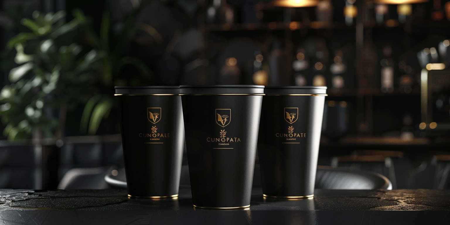
Shelf Impact and Visibility
Seasonal lines—think christmas paper cups—live or die by fast recognition. Shoppers give you about 3 seconds on shelf or at the café counter. That window favors bold contrast, large type, and a single focal icon. Metallics feel festive, but foil or heavy lamination complicates recyclability goals on cups; use them on outer wraps or accessories instead of the cup wall where possible.
On wraps, Spot UV or a soft-touch coating can add tactile cues with a modest cost impact—often in the 1–3% per unit range, depending on coverage and run length. On cup stock, a compliant water-based overprint varnish is the safer default. Keep special effects targeted: one well-placed gloss hit can do more than an all-over treatment, and it’s kinder to throughput when plate and registration complexity stays lean.
From a production lens, eye flow matters as much as color. Avoid ultra-fine lines near heat-sealed seams or at the cup base; those areas can distort during forming. If you want that crafted, natural signal, a kraft-toned wrap paired with strong iconography often tests well, especially in urban European cafés where sustainability cues influence choice.
Cost-Effective Design Choices
Design to run, not just to wow. Standardize die-lines, keep a shared core palette, and plan variable data where Digital adds real value (names, languages, micro-variants). For micro-runs, order quantities of 1–3k keep inventory risk contained; for stable items, Offset or Flexo carry you beyond that. A practical target: changeovers under 15 minutes on Digital or 30–45 minutes on Offset, waste in the 2–3% band on well-controlled lines, FPY above 95% once art and specs are locked.
One more bias from production: avoid chasing extra spot colors past the brand need. Every new plate or ink ramps complexity. For campaigns with both wraps and cup components, align color builds so both processes can hit the same ΔE range without exotic mixes. That’s how we keep the schedule predictable—and ensure the creative shows up on time, whether it’s a year-round hero or a limited drop alongside your printed paper cups.