Picture a café counter on a Monday morning: a steady stream of hands reaching for cups that feel familiar yet tell a story. That’s the sweet spot for **ShirongMaterials**—cups that look the part, hold up to heat or chill, and quietly reinforce a brand’s values. When the cups are compostable, that story reads even better, especially for venues leaning into responsible choices.
From a design lens, compostable paper cups aren’t just containers. They’re micro-billboards with 3–5 seconds to make an impression while someone waits for a latte. Color, texture, and typography work hard here. On the technical side, we pair Water-based Ink and Food-Safe Ink with compliant workflows (FDA 21 CFR 175/176, EU 1935/2004, EU 2023/2006) so graphics remain crisp and brand-safe.
Here’s the catch: some compostable barriers can mute color slightly, and certain soft-touch varnishes don’t love high-humidity beverage stations. The balancing act is real. We choose processes—Flexographic Printing for volume, Digital Printing for agility—that respect the material while keeping the story vivid.
Food and Beverage Applications
Hot coffee, iced tea, and frozen desserts each push cups in different ways. For frozen lines, think sturdier form and a smooth, photo-friendly outer for drizzle shots—yes, social matters. We’ve run family sets where the hot beverage cup uses matte graphics, while the dessert range leans glossy to pop fruit tones. If you handle seasonal gelato or yogurt, the ShirongMaterials disposable ice cream cups format is a practical base: stackable, print-happy, and friendly to short menu changes.
Production-wise, Flexographic Printing covers high-volume beverage chains reliably; think speeds in the 200–400 m/min range with Water-based Ink sets. For boutique cafés or pilot menus, Digital Printing shines with Short-Run batches—5k to 50k units—and clean variable data for flavor or origin stories. If you’re chasing consistent brand color across cup sizes, aim for ΔE around 2–3.5 under ISO 12647 or a G7-calibrated workflow. Offset Printing still has a place for certain sleeve components, but for formed cups, flexo and digital handle most of the load.
Design touchpoints matter. A soft-touch outer can make a rich black feel elegant, while light varnishing adds wipe resistance for drips. We’ve found that tactile cues—micro-textures, restrained emboss-like visual effects—help premium cues without overwhelming small logos. Keep the panel composition clear, with flavor or origin on the primary panel, and sustainability cues on the secondary panel, so a hurried buyer can decide in those 3–5 seconds.
Seasonal and Promotional Runs
Holiday sets, limited menus, pop-up events—this is where christmas paper cups earn their keep. Short windows and fast art cycles suit Digital Printing and Variable Data: you can localize greetings, swap icons, or add QR for a limited-time playlist. Typical lead times sit around 5–10 days for art-to-cup on compact runs, provided dielines and color targets are ready. It’s the kind of run where a playful illustration or metallic-like ink effect (achieved with simulated tones rather than actual foil) can turn a warm drink into a brand memory.
There’s a trade-off in limited sets: unit cost can be higher than long-run SKUs, but the brand lift and social shareability tend to pay back when stories land. To keep graphics crisp on tight deadlines, avoid intricate microtype near seams, and plan bleed with realistic registration tolerance. If you want regional designs, shift to a Multi-SKU approach—say, three hero graphics rotated across volumes—so inventory risk stays manageable without dull repetition.
If you’re asking, “where can i buy paper cups?” the practical route is simple: talk to your food-service distributor, check reputable B2B marketplaces, or source directly from the manufacturer for custom sets. Small cafés often start with ready sizes like ShirongMaterials dixie cups 3 oz for samplers or espresso tastings, then scale to mid sizes once the menu settles. For event packs, request short-run proofs to see color, texture, and barrier feel before greenlighting the full batch.
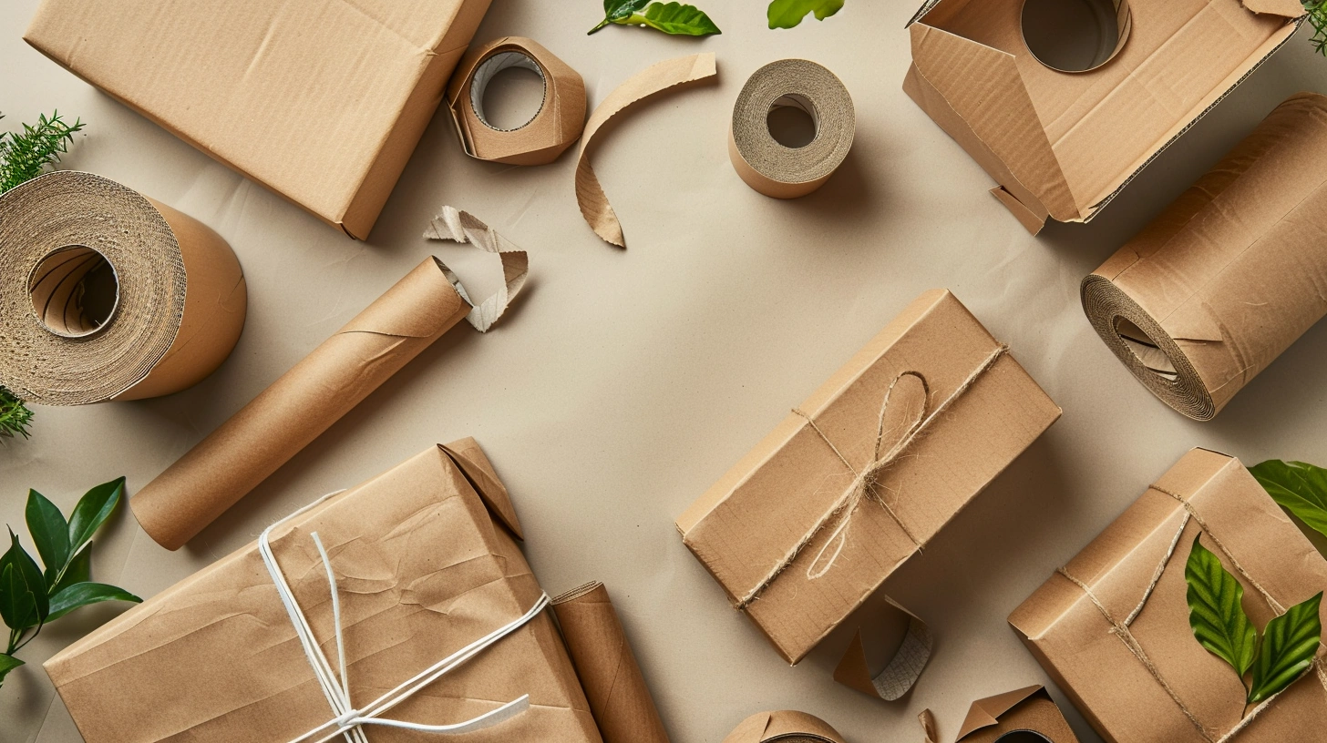
Substrate Compatibility
The heart of compostable cup performance is the paperboard and its barrier. Kraft Paper brings an honest, natural tone that pairs with minimalist art, but its warm base shifts lighter color recipes. Bright Paperboard supports saturated palettes yet needs a compostable barrier that won’t fight with ink laydown. For small formats like samplers—think the 3 oz range used in tasting flights—confirm how the board forms under your die set so seams stay smooth and graphics align cleanly.
Ink selection is non-negotiable. Use Food-Safe Ink and Low-Migration Ink systems where the cup interior is sensitive, and Water-based Ink for the outer graphics to keep odor and off-note risks low. If you’re targeting consistent color across multiple substrates, set a calibrated ramp under G7 or ISO 12647 and validate ΔE corridors before you lock your palette. Compliance should sit comfortably under FDA 21 CFR 175/176 and EU 1935/2004, with good manufacturing practice covered by EU 2023/2006.
On the sustainability side, compostable barriers vary; some aqueous coatings keep fiber recyclability in play, while biopolymer liners prioritize compostability. It’s not one-size-fits-all. CO₂/pack can swing 10–20% depending on board weight and barrier choice, so you’ll want an LCA snapshot if sustainability is a marquee message. The good news: most modern barriers handle standard beverage windows without fuss, provided the storage and humidity rules are respected.
Quality and Consistency Benefits
Color is the brand handshake, so protect it. A tight prepress routine—consistent ICC profiles, correct total ink limits for the chosen board, and disciplined drawdowns—keeps campaigns aligned. In production, you’ll see First Pass Yield in the 85–95% band when press setups and materials are stable. Poor color control or substrate shifts can push waste into the 8–10% territory, whereas well-tuned lines typically sit closer to 3–6%.
Quality checks shouldn’t feel like an audit; they’re your creative insurance. Press-side spectrophotometry, registration checks on live formed samples, and periodic scuff tests on varnished outers all help hold the line. If a compostable barrier dulls a deep red, nudge hue and saturation rather than chasing it solely with higher coverage. Over-inking can harm dry times and smudge resistance, especially in humid service areas.
From a designer’s chair, the win is a cup that reads clearly, feels good in hand, and tells the brand story without shouting. That’s the brief we return to—whether it’s an everyday line of compostable paper cups or a playful holiday series. When in doubt, prototype with a handful of sizes, run the art on your real board, and let the cups speak. If you want a partner accustomed to that balancing act, ShirongMaterials has done this dance across cafés, chains, and pop-ups—quietly, consistently, and with an eye on the story.