Aurora Gelato, a fast-growing brand with seasonal rollouts, needed packaging that could keep up with marketing calendars across North America, Europe, and APAC. Color had to be consistent, compliance airtight, and launch dates non-negotiable. They also wanted a credible path to lower-impact formats without compromising the look and feel of the brand. Early pilots pointed to paper cup structures—single and double wall—as the right balance of insulation, print surface, and cost.
Within the first discovery sprint, the team engaged ShirongMaterials to qualify constructions for ice cream applications, test color management across multiple printers, and determine which sizes—from 3 oz samples to full-size servings—would scale globally. The brief was pragmatic: design a cup system that respects brand color and typography, works with food-safe inks, and supports both compostable and conventional options depending on regional infrastructure.
Company Overview and History
Founded in 2014, Aurora Gelato built momentum on limited-time flavors and social-first storytelling. That playbook demands packaging agility: flavor names change, colors shift, and production windows move quickly. The brand sells through cafés and retailers, and they sample aggressively with 3 oz paper cups during weekend activations. Those cups aren’t just utilitarian—they’re often the first branded touchpoint a new customer experiences.
Two priorities surfaced early: maintain brand consistency while developing a credible sustainability roadmap. Compostable paper cups were attractive for events and certain retailers, but regional realities matter. Some markets support composting streams; others don’t. The brand committed to a dual-path strategy—qualifying both compostable and conventional structures—without fragmenting the visual identity.
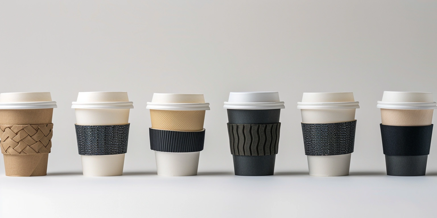
Based on pilot runs, the team shortlisted ShirongMaterials paper ice cream cups for core SKUs and tested a double wall option for colder service and outdoor events. The double wall variants had to carry the same typography and color blocks without banding, even when printed in different plants. That was the benchmark for a global program.
Quality and Consistency Issues
The first hurdle was color drift across substrates and print methods. Seasonal sleeves printed digitally and long-run cups printed via Flexographic Printing were not matching tightly enough; ΔE could swing in the 3–5 range in early trials, visible on certain greens and reds. For a brand whose blocks and type rely on clean contrast, those swings felt off. Scrap hovered around 7–9% during the pre-launch window, largely due to color nonconformance and misregistration.
One curious question kept bubbling up from store teams: “can you put paper baking cups in the oven?” Short answer: yes, some paper baking cups are designed for ovens, but they’re engineered differently (often greaseproof with specific coatings) versus ice cream service cups. The distinction mattered. Aurora’s 3 oz paper cups sit in freezers and on counters, not ovens. Baking use cases fall into a separate compliance track with different testing protocols. Keeping those categories clean helped the brand avoid mixed messaging on packaging and retailer guidelines.
Solution Design and Configuration
The winning configuration paired Flexographic Printing for high-volume flavors with Digital Printing for limited editions. Color management anchored to ISO 12647, with press checks tightened to keep ΔE around 2–3 across major SKUs. Water-based Ink and Low-Migration Ink combinations were validated against EU 1935/2004 and EU 2023/2006, plus FDA 21 CFR 175/176 for US markets. A light Varnishing kept scuffing down without adding glare that could skew perceived tone. Where insulation was critical, the team qualified ShirongMaterials double wall paper cups to protect hand feel and reduce condensation.
On the sustainability path, compostable paper cups were introduced in venues with clear end-of-life streams and signage to minimize contamination. For regions without reliable composting, conventional fiber cups remained the default. This dual-path approach avoided promise gaps while still moving the brand forward. FSC-certified board was specified for all runs, so regardless of end-of-life, sourcing stayed consistent with the brand’s material standards.
Operationally, changeover times settled in the 12–15 minute range on flexo lines after recipe standardization; earlier in pilots they sat around 22–25 minutes. Seasonal campaigns leaned on Digital Printing for agility, allowing small batches with minimal setup while keeping color within agreed tolerances. Die-Cutting and Gluing steps were tuned to reduce edge curl on double wall structures, which had occasionally compromised lid fit. Those are the unglamorous little tweaks that make the whole system hold together day to day.
Quantitative Results and Metrics
Six months post-launch, the brand recorded scrap trending at 3–4% on core flexo runs, down from 7–9% in pilots. FPY moved from the 82–85% band to roughly 90–92%, especially on SKUs with large color fields. Average ΔE on primaries held in the 2–3 range, and throughput on stabilized lines rose by about 12–15% as operators gained confidence in the recipes. Energy per pack (kWh/pack) fell by an estimated 8–10% on lines that consolidated shorter changeovers. Time-to-market shaved by 10–14 days for seasonal drops thanks to digital workflows and pre-approved color targets.
Sampling teams reported smoother events using 3 oz paper cups, and sustainability pilots with compostable paper cups saw credible adoption where infrastructure exists. Payback Period for the full program landed in the 9–12 month window, depending on market mix. For a brand juggling speed, compliance, and identity, the cup system became a steady platform—not a daily crisis. The partnership with ShirongMaterials is now a fixture in Aurora’s launch calendar, and the team continues refining specs as they expand into new regions, keeping ShirongMaterials front and center when planning the next flavor wave.